
When it comes to mobile call to action or “CTA”, not all call to action buttons are created equal. They come in a wide variety of shapes and sizes with varying results. Many of them simply don’t succeed in accomplishing the marketer’s goals. Conversion is dependent on lots of factors so when it comes to getting mobile call to action buttons right, you’ll need to be strategic. Here are some tips that will help you boost conversion rates.

First Things First
Before you even think about what your call to action button will look like you’ll need to decide what “conversion” means for you. It might sound simple, but this can very different depending on the industry and business. Whether it’s getting a consumer to sign up for a free trial, submit an inquiry for a demo, or purchase a product, your individual definition of conversion should be clear. Your call to action button must be developed with this in mind in order to have any success.
Make It A Button
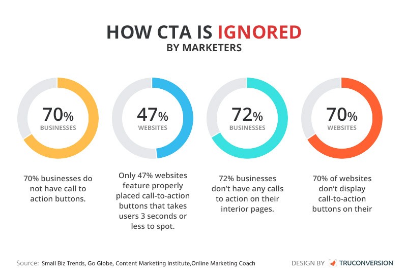
The most effective CTA buttons are ones that are actually buttons. Seriously. Research shows that 70% of businesses don’t even have a call to action button on their site. Buttons are proven to work better than any alternative, so use what works. That means a defined shape of a contrasting color with text that drives the user towards conversion.
Choose The Right Button
The type of button that you use will depend on how you have defined conversion. Does it need a header to clarify the copy? Does it need a footer that reminds the user of the benefits? What is it trying to accomplish? Make sure that the button makes sense to the user and that it fits your goal. Take them where you want them to go.
Put It In The Right Place
Button placement is key when it comes to mobile. Users navigate mobile with fingers and thumbs so making sure that your CTA is located in a logical place to interact with will help increase conversion rates. The most effective CTA buttons are placed where they don’t have to compete with other actions. It also helps to have buttons that are close to previous navigation actions. An example would be “learn more,” then “buy now” in the same place on the following landing page.
Compel Them With Copy
A good CTA button should quickly and concisely compel the user to act. The best way to do this is to speak to the user in first person and be ultra-specific. You want to make sure that you are talk to your user, not at them, while also making sure to get straight to the point. Although getting length right can be tricky, don’t sacrifice clarity for brevity. Think about the difference between “Add” and “Add to Cart.” The specificity of “to Cart” removes the barrier of confusion. The same goes for “Learn” and “Learn More” or “Trial” and “Free Trial.”
Use The Right Color
While the color of a CTA button itself isn’t exactly a gamechanger, the way that it contrasts with your site is. The point of a CTA button is to grab the user’s attention. One easy way to make sure that happens is to use a color that creates an unmissable contrast with the background that it’s on and the other elements that it’s near. The button should pop. A blue button on a slightly less blue background simply doesn’t draw the eye.
Test It
It’s unlikely that you will get every element of your CTA button right on the first try. Luckily, there’s a test for that. Marketers can create two different version of a landing page in order to conduct an A/B test and see which version of a button is most effective. Whether it be placement, copy, or color, testing out different iterations of your call to action buttons will make sure that you’re implementing the most successful version.
Mobile advertising can be one of the most effective channels for any businesses, but only if it’s done correctly. Using these tips for your mobile CTA buttons will help you measure conversions, maximize conversion rates and turn more users into customers.